
Benevolent Sin: Sketch Poster
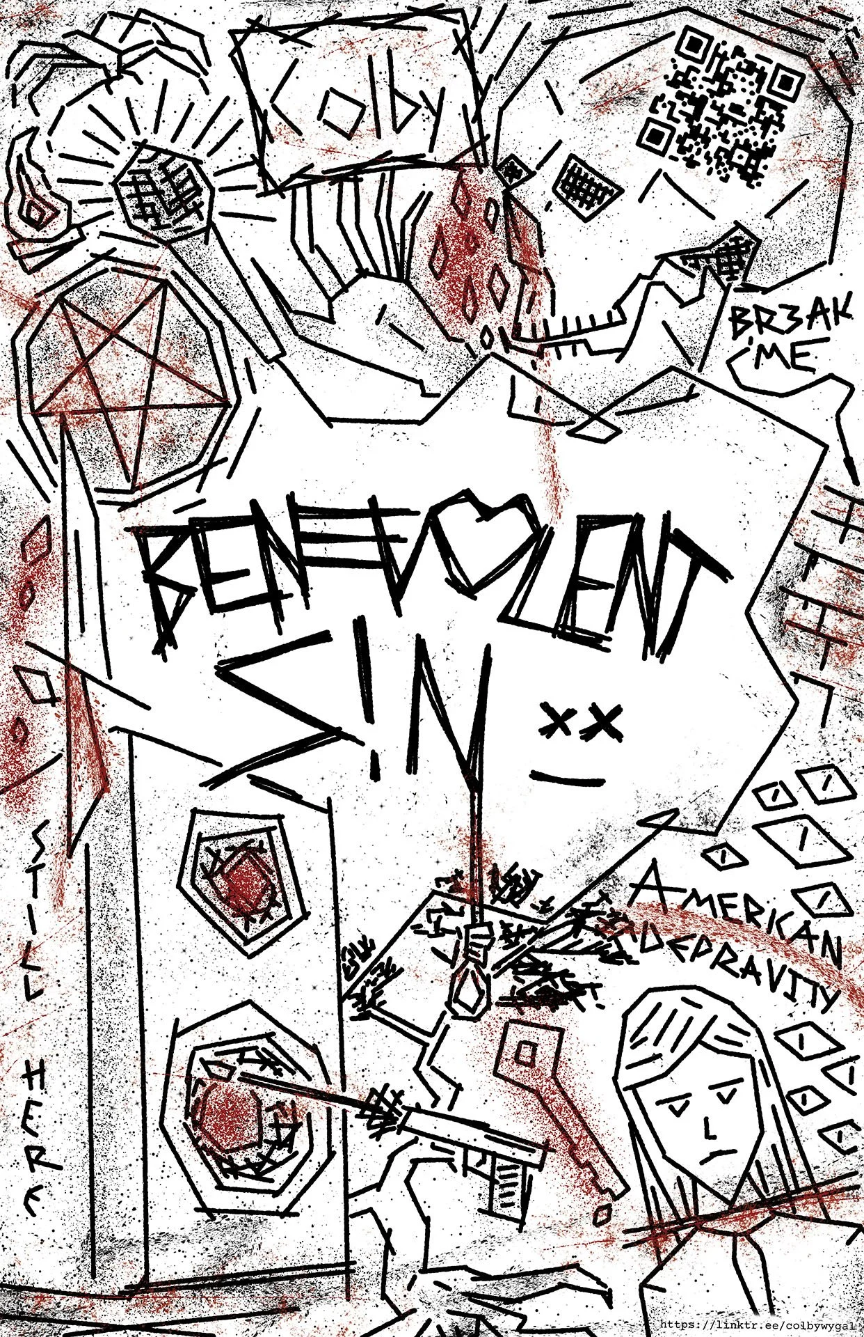
Benevolent Sin Sketch Poster, Illustration, Graphic Design
Benevolent Sin has been a name I’ve carried with me since late 2023 as a personification of the bold new direction I was taking my music in. Yet it would take nearly two more years for me to unify all my unique ideas for this brand into one cohesive package. This poster was the first clear depiction of exactly how Benevolent Sin looks, feels, and sounds, and it ushered in a strong new era for my identity as an artist.
I designed this poster as a unique, high-quality handout for fans and professional connections. When I created it, I was preparing a table I would host at Millikin University’s annual Design Showcase event. You can learn more about my work hosting and participating in the event through the highlighted link. As a first and hopefully long-lasting impression with new people, I needed the poster to be eye-catching and perfectly indicative of my brand’s identity. I already had plenty of brand assets available for this, but I had grown dissatisfied with these first iterations, as I felt the visuals were uninspired and far too clean to match the gritty aesthetics of my music. I had to ask myself what I really wanted Benevolent Sin to look like in the years to come, and I pivoted from there.
Benevolent Sin is dark, distorted, and abrasive. From this point on, I decided that every asset would be hand-drawn, using layers upon layers of harsh straight lines. There would be no smooth curves or clean corners. Everything would appear as if it were violently etched into the page with little concern for symmetry or detail. I remade my logo with this new design ideal in mind, and I filled the rest of the page with meaningful imagery. I drew inspiration from everywhere, looking for unique ways to represent everything my music stands for. It’s love and hate, pleasure and agony, past and future, life and death. The name Benevolent Sin itself is an inherent contradiction that spans the spectrum of good and evil. This poster is a chaotic blend of abstract and literal depictions of my brand’s nuanced and broad-spanning ethos.
There are countless references hidden in this design for those who are looking for them. Still Here, the title of my debut album, is etched in the bottom left corner of the page. The envelope from the cover art of Colby <3 is depicted at the top of the poster, and the sketches on the cover are shown at the bottom. The all-seeing eyes from the cover of “I’m Scared, You Win” lurk next to these sketches among many other icons of my discography. The hidden meaning of these sketches goes incredibly deep. Some are secrets that only I know, some are hints at projects yet to come, and some are just simple doodles on the page. I’ll leave most of the meaning up to your own interpretation.
Beyond the visual appeal, this poster has the additional utility of being a direct link to my work. The original copies directed viewers to my Linktree page, but future prints will be updated to take them directly to Artistry Redefined. In accordance with the new brand guidelines I set for myself, the QR code was pasted onto the page and then hand-traced to match the design’s aesthetics while still being fully functional.
I’m incredibly proud of this poster for everything it’s accomplished. It was a massive success in fulfilling its original purpose, as nearly every poster I printed was given away at Design Showcase 2025, and since then, I’ve seen copies hanging in bedrooms and offices across the country. Yet the poster completed an even greater goal of finally consolidating all my ideas for Benevolent Sin into a cohesive, digestible, and forward-thinking set of ideals and design principles. Later in the academic year, I submitted this design to the 2025 American Advertising Federation Awards, and I won a silver ADDY in the Southern Illinois Chapter. For more information on the past, present, and future of Benevolent Sin’s brand identity, check out this linked article.
