Life Is Art, Art Is Life (Greeting CaRDS)
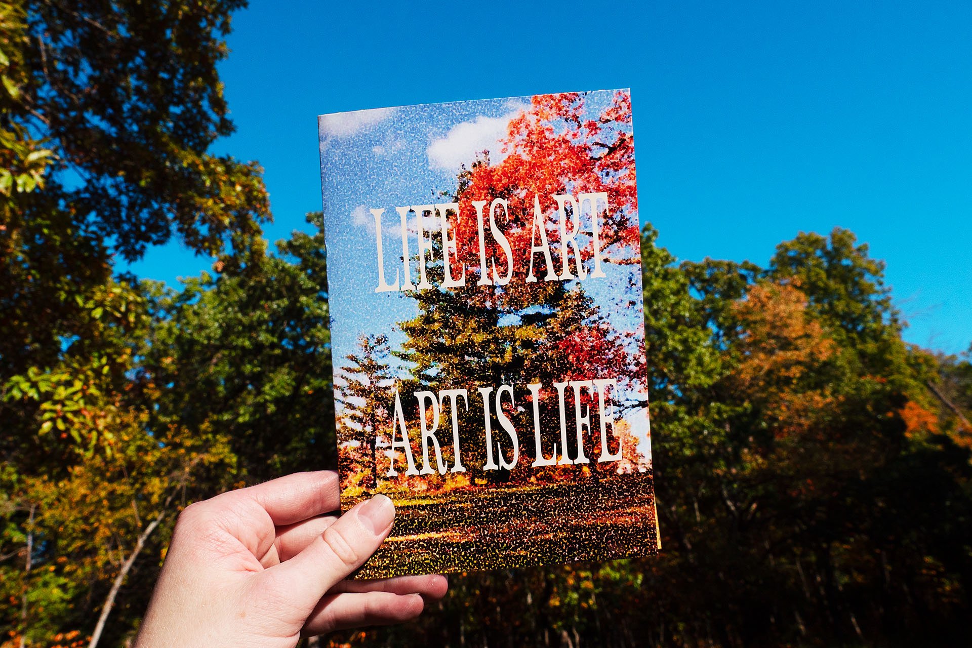
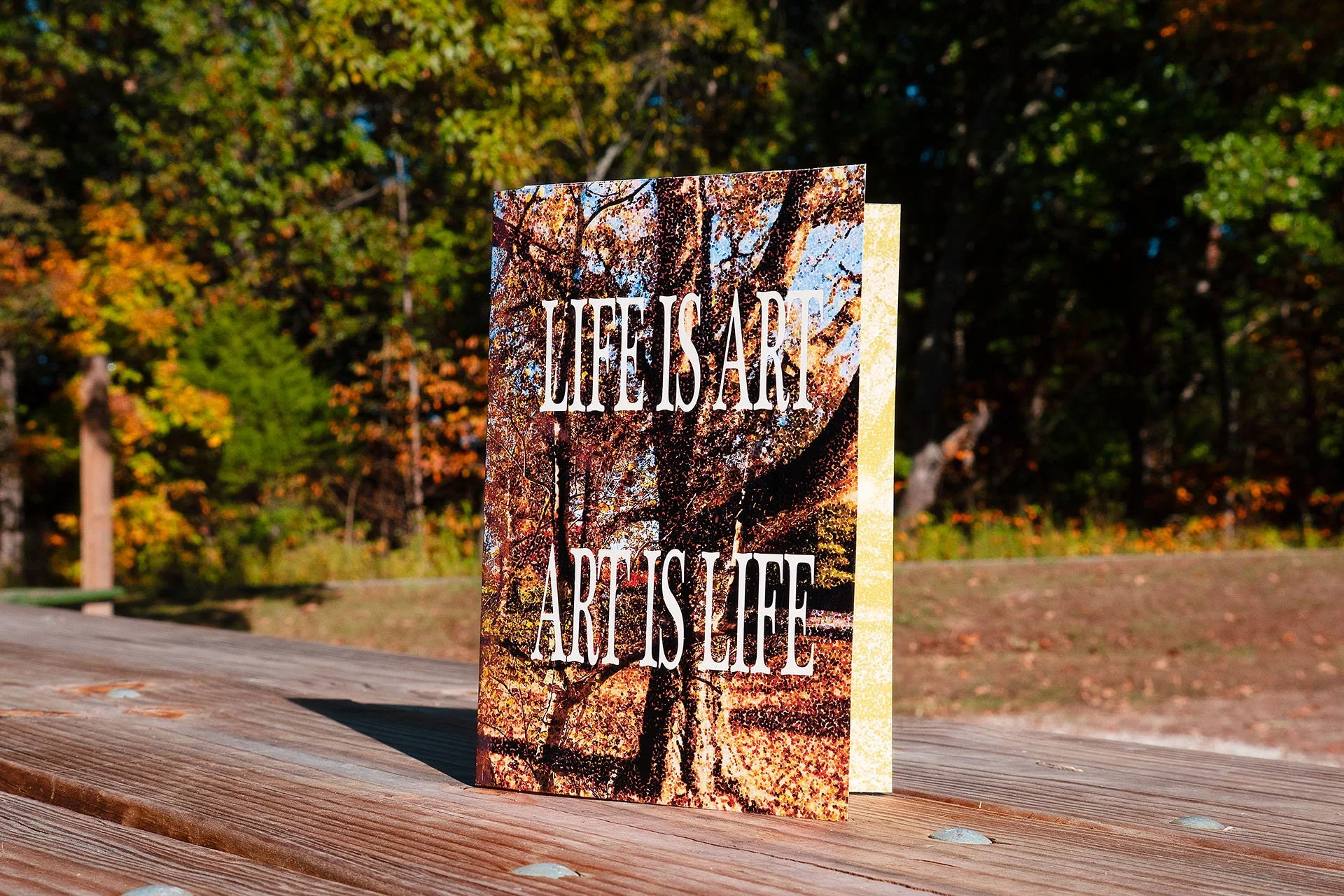
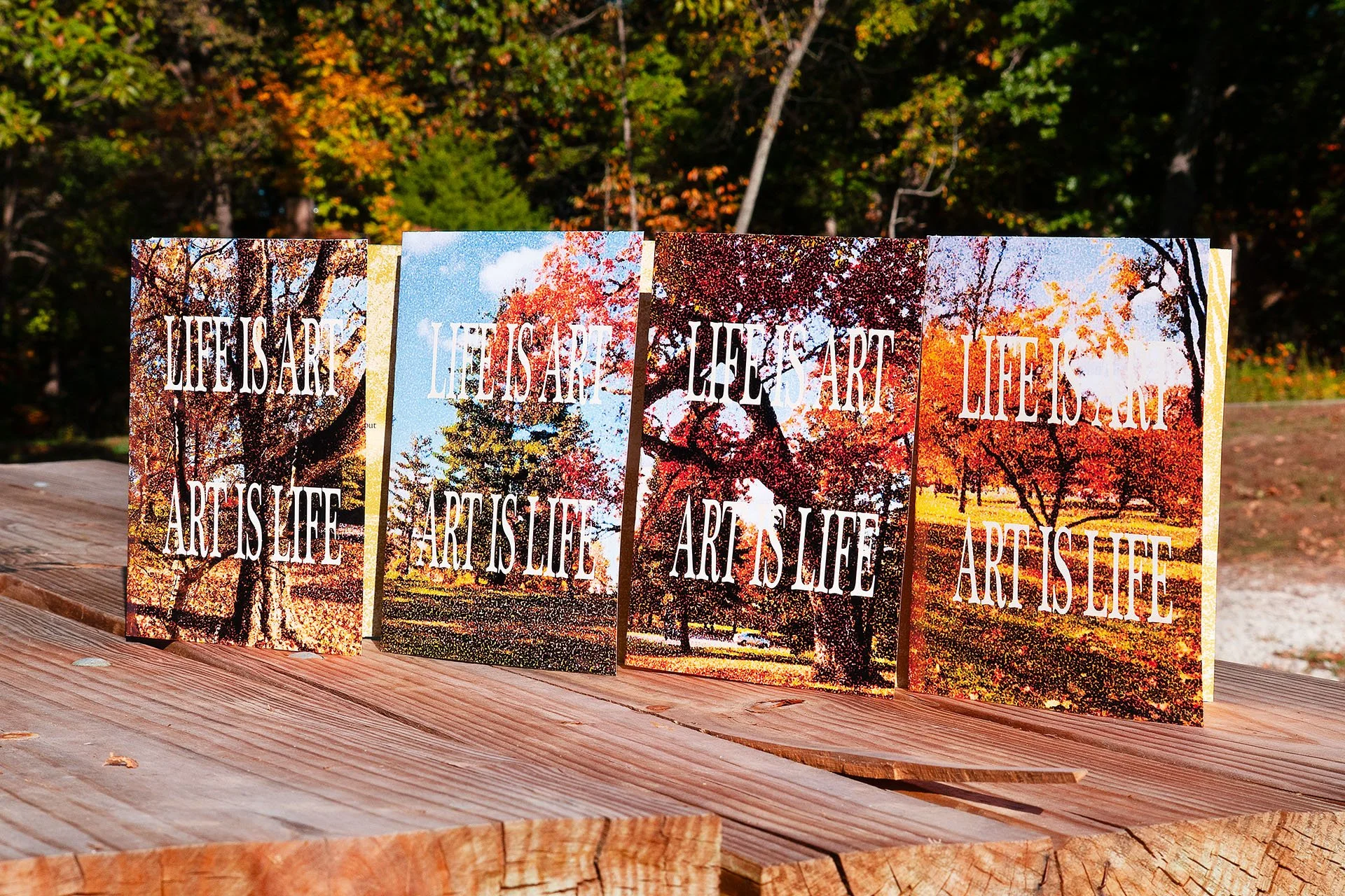
Life Is Art, Art Is Life greeting card #2.
graphic design, photography
This cohesive series of greeting cards was an exercise in thoughtful design and printing early in my undergraduate studies at Millikin University. I was given simple criteria: each card would include a quote on the inside and incorporate the phrase “life is art, art is life” somewhere in the design. I considered the emotions and visions that this reflection on art evoked for me, and I found my way forward.
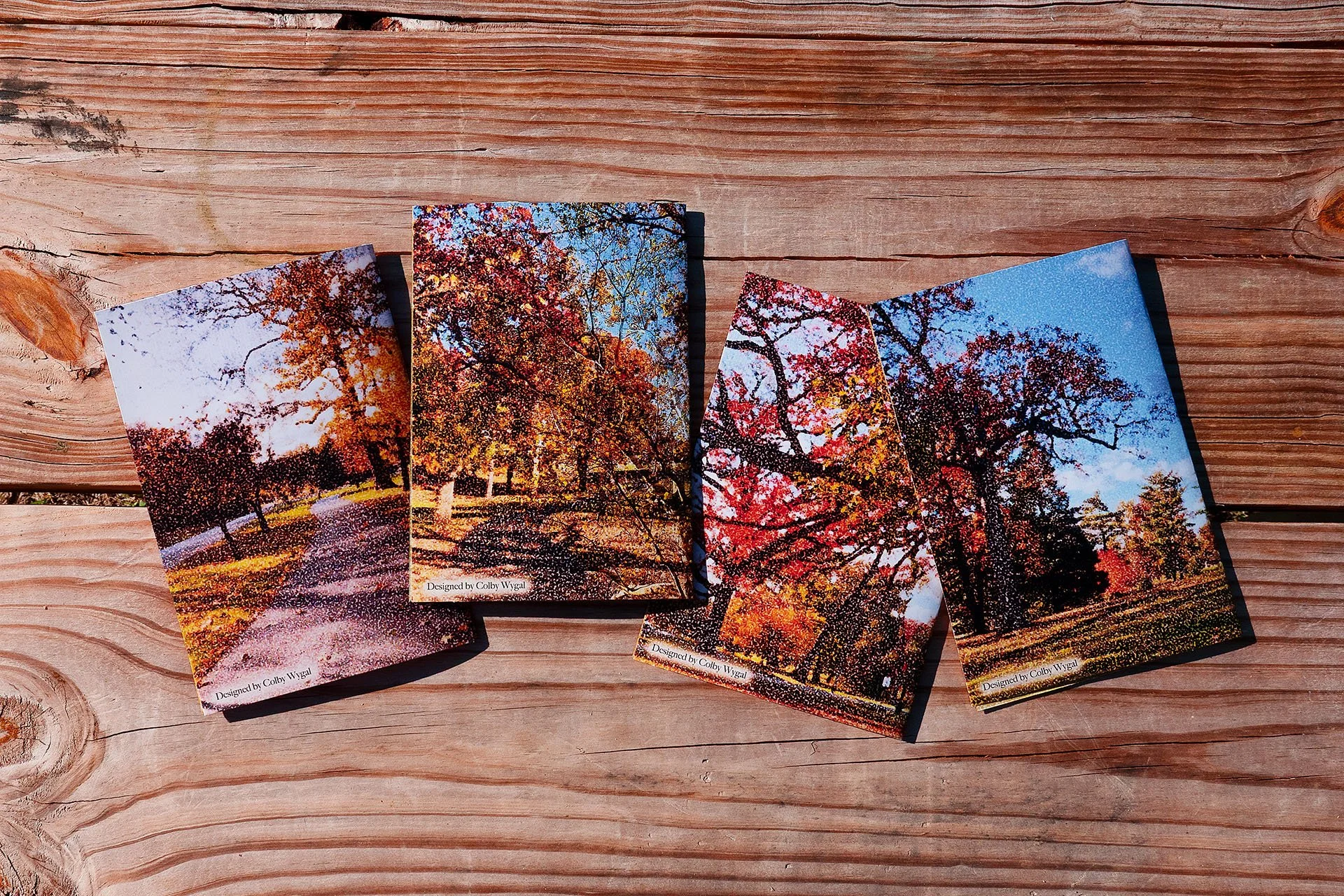
I chose to direct my scope toward nature, as it’s where I feel most intrinsically connected to art and beauty. I photographed autumn leaves, rolling hills, and winding paths in a park near my campus. Unlike most of my work, this was not an effort to push boundaries or change the way people perceive art. The process was simple. I found peace in the simplicity. That feeling of calm was exactly what I aimed to capture in these designs.
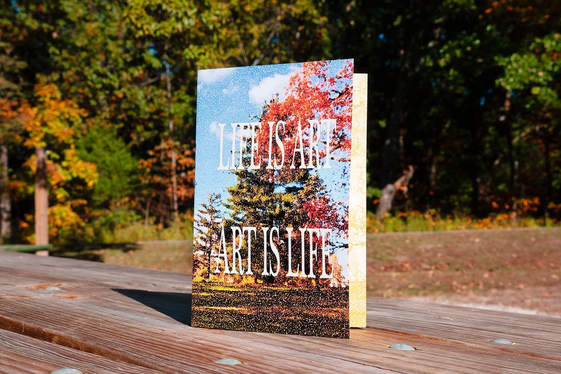
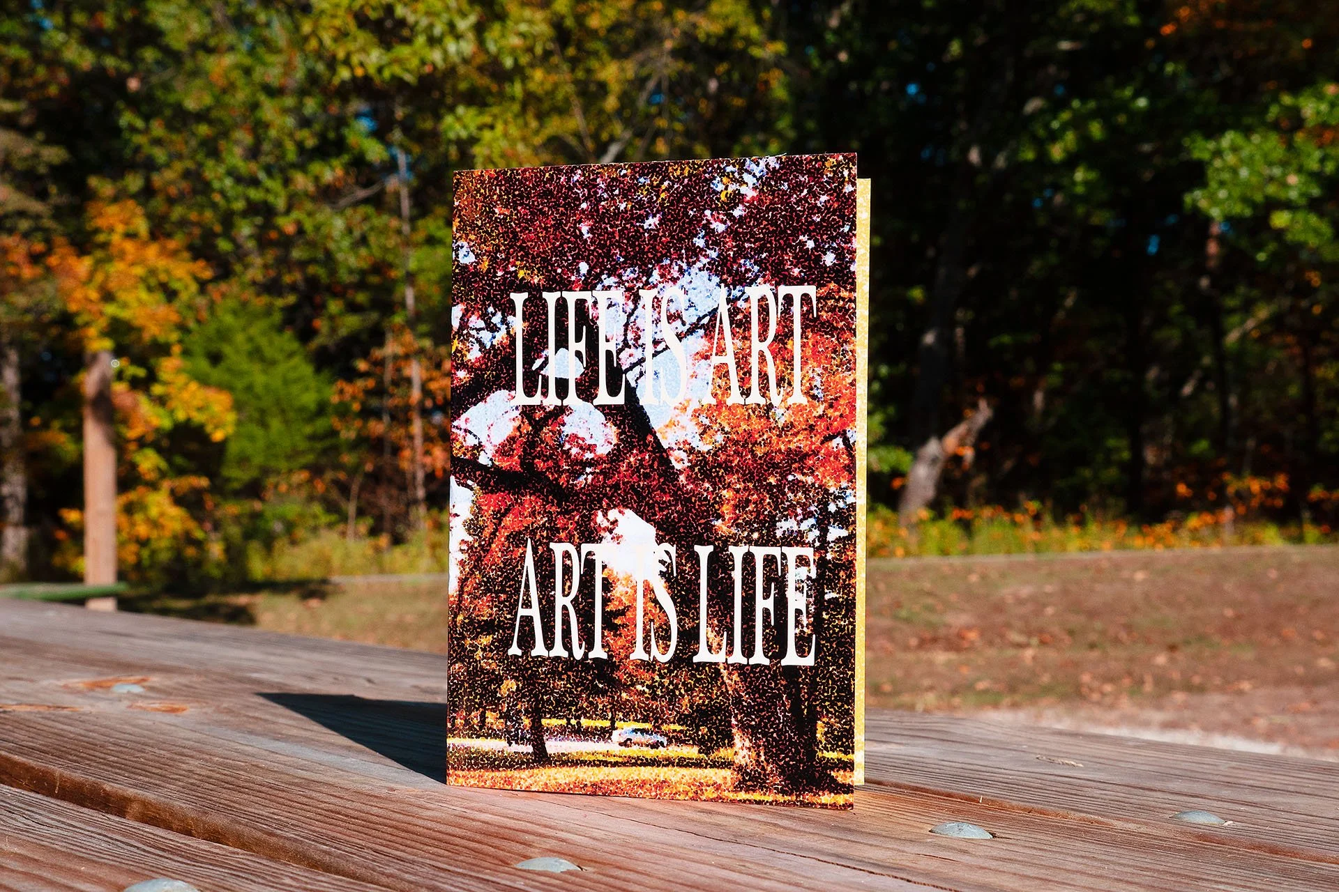
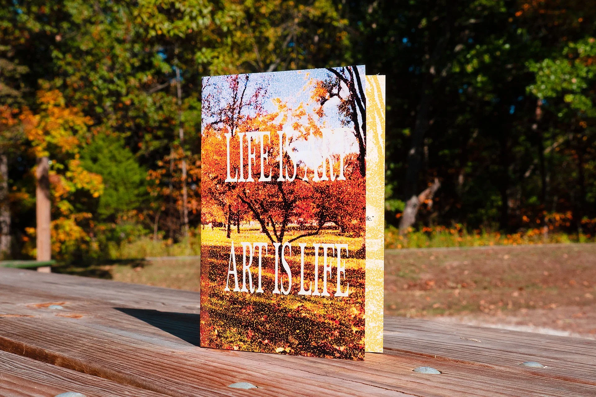
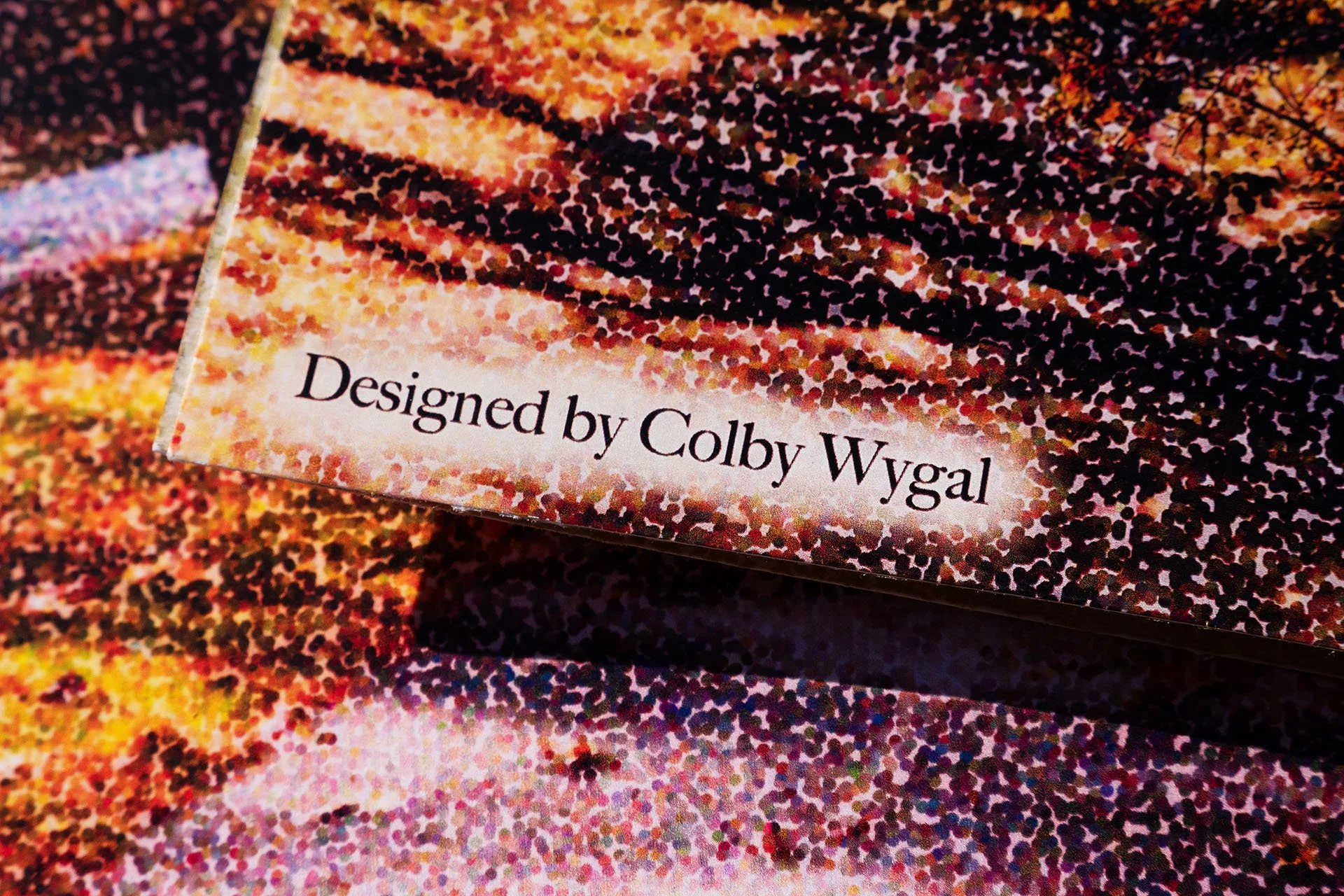
I chose a collection of my favorite photos to edit, adding a warm, slightly yellowed color grade to each of them. For some of the cards, I composited multiple photos at different opacities to create abstract branching textures. With each, I applied a pointillism filter to the finished composition, transforming a simple photo into a constellation of vibrant dots blending into a natural form.
The front text on each card is stately and nostalgic. I used a simple serif font and stretched it vertically to mimic early computer-generated word art. It’s an homage to countless amateur early-internet graphic designers, as I find it reflects the desire to create that’s found in every human being—a desire which has only been amplified by the birth of the internet. This is not what would traditionally be considered professional typography. It’s simple, oddly proportioned, and at times, even hard to read. But it’s human in its rawest form, and that’s exactly what I needed for this design.
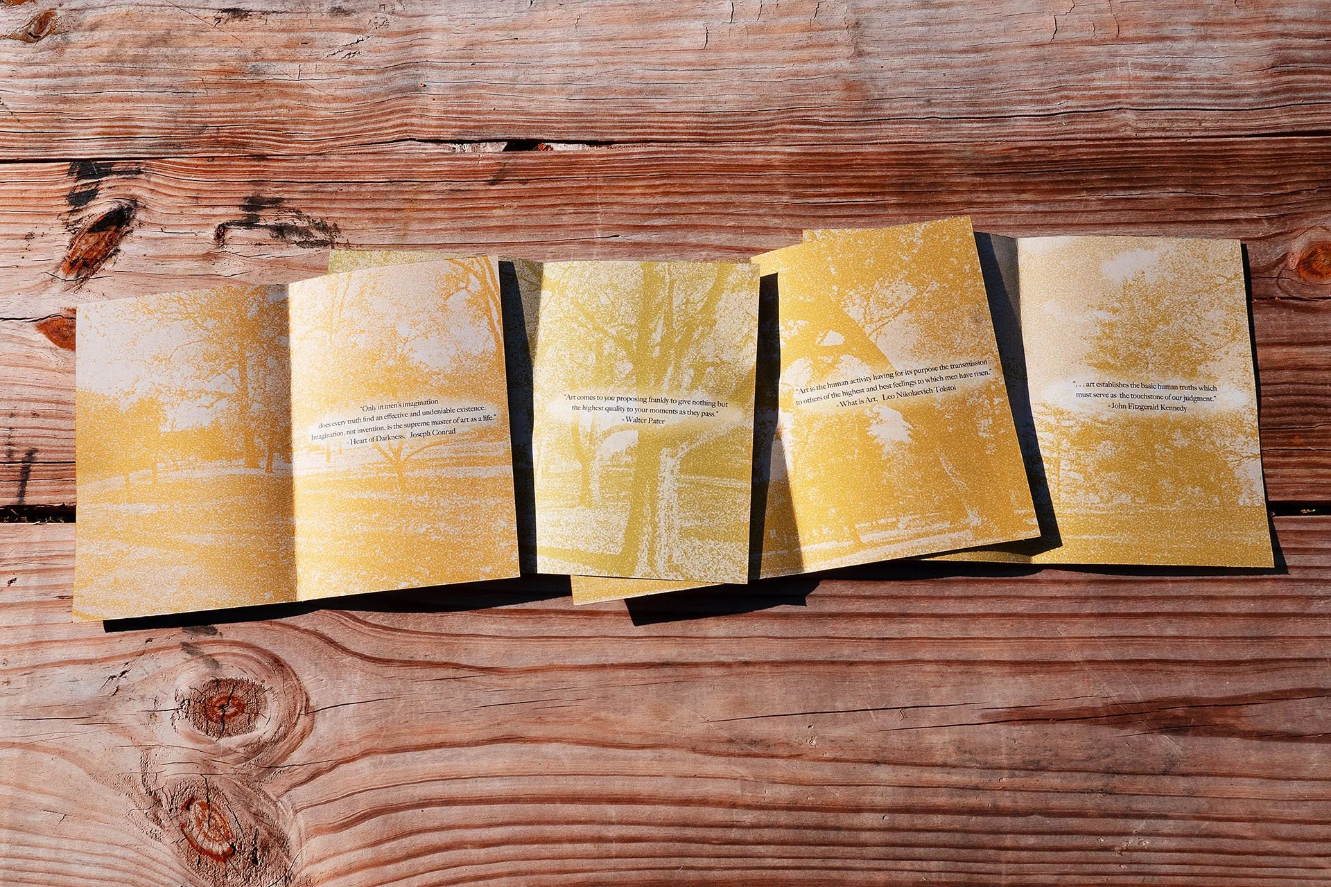
Inside each card is a thoughtful quote from a historical figure contemplating the nature of art. The background is a recoloring of the cover image, this time draped in light beiges and yellows. Like the rest of the design, this too is simple and understated.
The final designs were printed onto cardstock pages, with glossy outer layers that turn their semi-muted earth tones into vibrant bursts of liveliness. The insides of the cards are matte to complement the drab interior color palette and to make writing personalized messages easier. I photographed my printed cards nearly three years after designing them in class as I prepared to write this article. I wanted to once again capture the beauty of autumn leaves in these portraits, so I waited for the perfect day and traveled to a scenic park in my hometown. Like the designs themselves, these product photos are intentionally simplistic, yet I find they subtly depict the years of experience I’ve gained. With the sun bearing down and the wind fighting against me, I had to move confidently and exhibit absolute faith in my camera knowledge and editing abilities. Most of my RAWs were utterly unappealing with the way the sun affected my shots, but I made strategic decisions in configuring my exposure, and I was confident that I could fix the lighting in post-production. And after a bit of tweaking in Photoshop, my final images look vibrant and natural—a testament to my talents as a photographer.
To me, this was a lesson about finding confidence in restraint. Taking photos of trees in a park is not a complicated or revolutionary idea. I can’t name a single person in my life who hasn’t photographed a tree before, and that ubiquity is what turned me away from pursuing subjects like this in the past. It feels almost amateurish to do what everyone else has done before. But it raises the question: why do we all feel an urge to make art about trees? I think it’s because trees are an ever-persevering symbol of life on Earth. I can’t imagine a more perfect image to represent art and the human spirit than that which nature provides. We make art about life because life is art.