
Otto’s Exhilarating Adventure: Character Posters
This series of character posters was the first of many works I completed as part of a comprehensive media campaign for the premiere of Otto’s Exhilarating Adventure. Each design is a stylized representation of a character’s personality and the coveted sentimental item that drives them through the story’s sinister scavenger hunt.
At the start of my services, I had a meeting with Kev Dionysis, the film’s director and my main point of contact at Blue Hour Studios. They asked that the character posters have a lighthearted scrapbook aesthetic that represents the characters and the film’s overarching themes in a fun way. I was transferred raw files from a cast photoshoot to use as the basis of my designs, and I quickly got to work. Each poster is a collage of edited character photos, handwritten notes, and various symbolic images that I licensed through Creative Commons. Every character sits in front of a Polaroid frame with an image that matches their personality in a literal or abstract way. I cut each image out of its background and outlined it with a rough paper texture to make everything feel handmade. I lettered each name card myself, using different writing styles and adding sketches that evoked the characters’ personalities. The final compositions were polished with shading, color grading, and a gentle film grain to make everything cohesive, and I’m quite happy with how they turned out.
These posters were delivered to my client at Blue Hour Studios in two sets. First was the core four: Otto, Janice, Mindy, and Landon. These are the main protagonists of the story, and their posters were the first to be uploaded to Blue Hour’s social media to build excitement for their upcoming premiere. Second were the three side characters: Jen, Selena, and Stacey. These characters have minor roles in the story and were designed later as bonus content separate from the original promotional strategy. In time, each of these graphics was uploaded to social media, and they had the desired effect of capturing the film’s energy and building anticipation for its release.
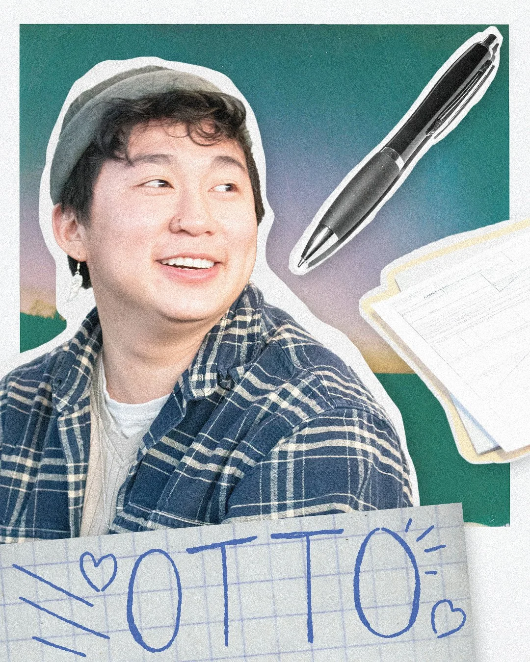
Otto is the film’s main protagonist. They’re an overthinker at heart, constantly anxious about failing. They feel dependent on the perceived luck that their special pen, Pearl, seems to provide, and when that pen goes missing before a major test, they spiral into self-doubt.
This was the first of my seven designs. I featured a pen similar to the one Otto uses in the film, along with stacks of exam pages. As much of this film dissects Otto’s attachment to material things, this design is fairly straightforward with limited symbolism.
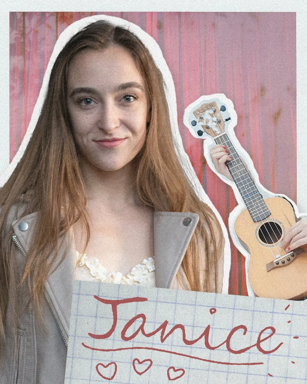
Janice is Otto’s counterpart in this journey. Where Otto sees risk of collapse, Janice sees a chance to flourish. She feels a compassionate need to push Otto to accept new opportunities and face challenges with courage, though her love can be harsh at times.
Unlike most characters in this story, Janice does not seek out a sentimental object. Near the end of the film, she’s seen strumming a ukulele, and I latched onto that visual for this design to serve as a symbol for her creativity and precision. I lettered her name in flowing cursive to represent her refinement as a character.
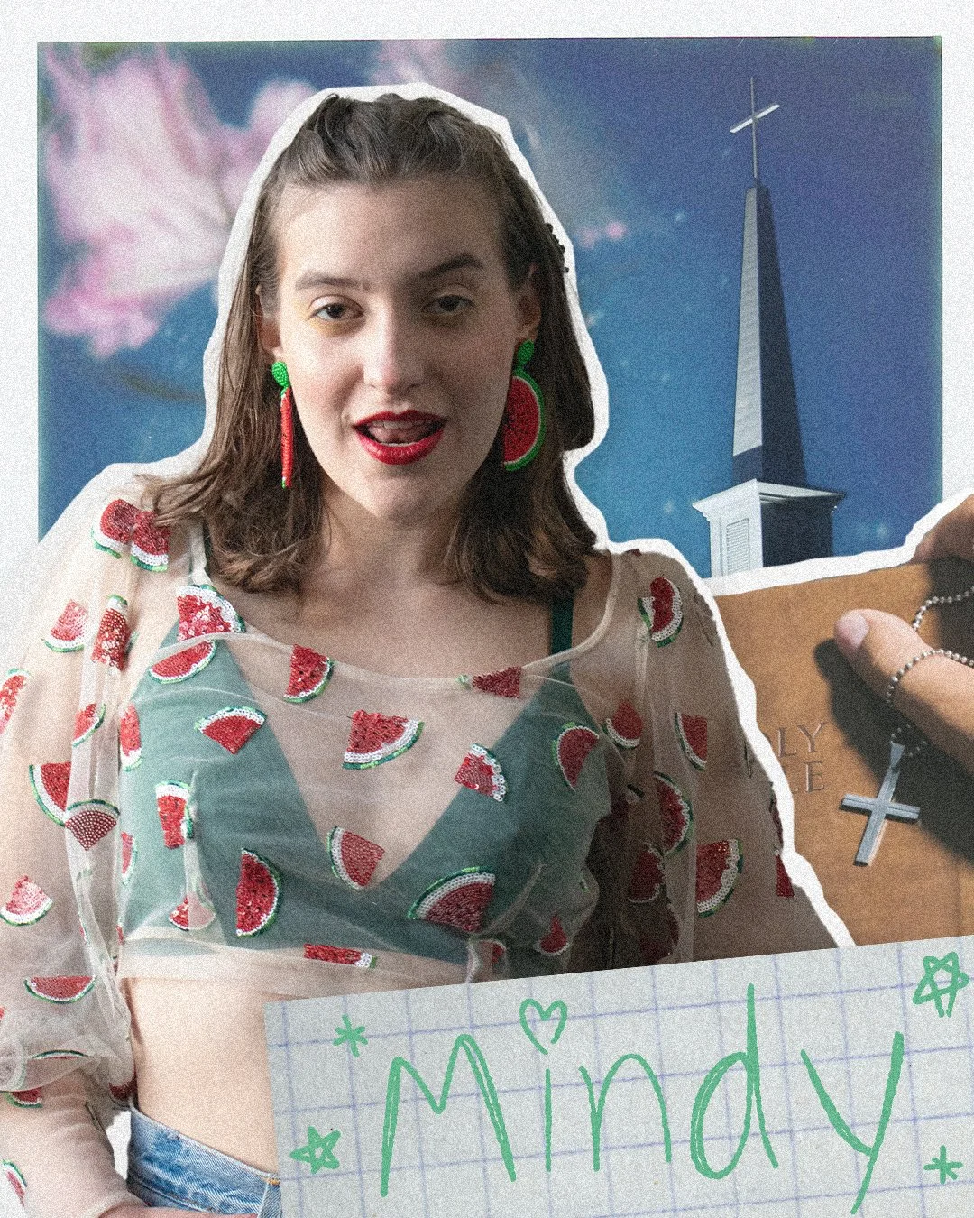
Mindy is Landon’s best friend. She’s the most compassionate of the group, always offering a voice of assurance during her friends’ lowest moments. Beyond her bubbly personality, Mindy is a deeply competitive person troubled by feeling trapped in hiding her identity. She struggles with the consequences of generational religious trauma as she fights to find her late grandmother’s cross necklace.
This is my favorite design of the core four, taking the production team’s fantastically stylized costume design and blending it with religious iconography and carefree sketches to fully encapsulate Mindy’s character.
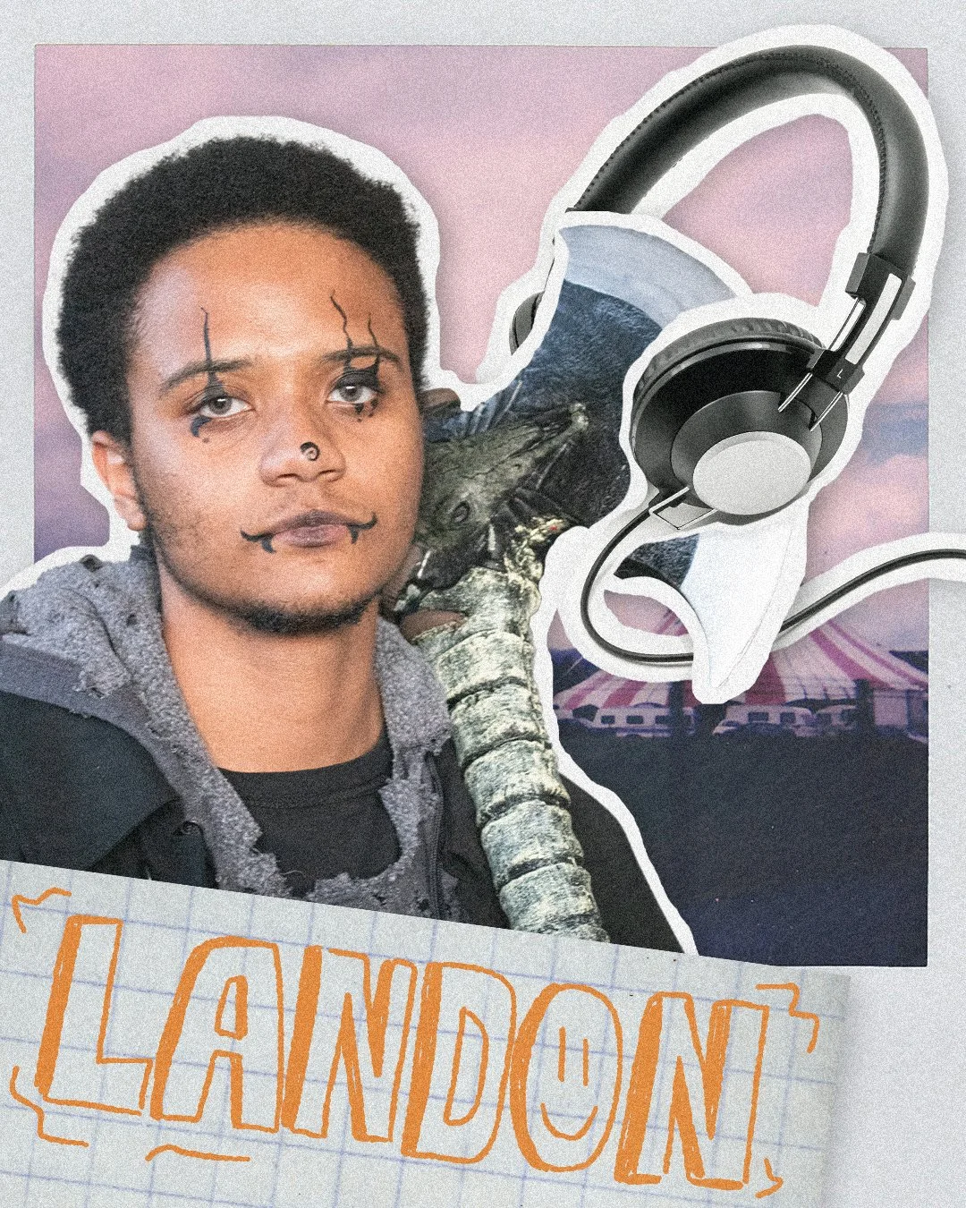
Landon is Mindy’s best friend. He’s the quietest and most awkward in the group, but he’s an unwavering support for everyone who loves him. Landon helps Mindy on her journey while he, too, searches for a sentimental item: his father’s old headphones, which were a final gift before he left.
I featured a headshot of Landon holding his signature battleaxe. I found that this item, along with the headphones, was an excellent depiction of his character, representing the emotional strength and protection he offers to his friends. I designed Landon’s bold and blocky name card to reinforce this idea.
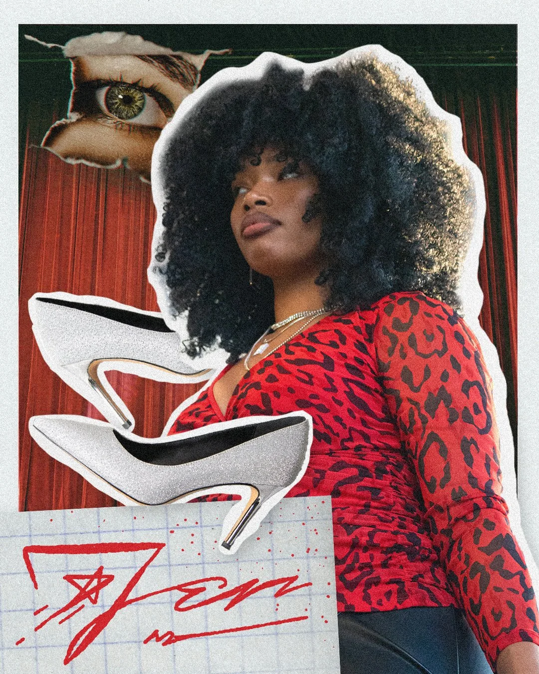
Jen is the enigmatic face of the ensuing quest. She has a love for theatrics and mystery, and carries herself like an otherworldly messenger. Jen presents our characters with the rules and stakes of the game, and she seems to know everyone’s deepest secrets.
This is by far my favorite design. I love the way that Jen’s theatrical flair and mysterious nature are on full display, featuring her signature sparkly heels, a watching eye that bursts through the page, and a flashy cursive signature. And of course, I’m sure you’re plenty aware of my partiality toward the color red.
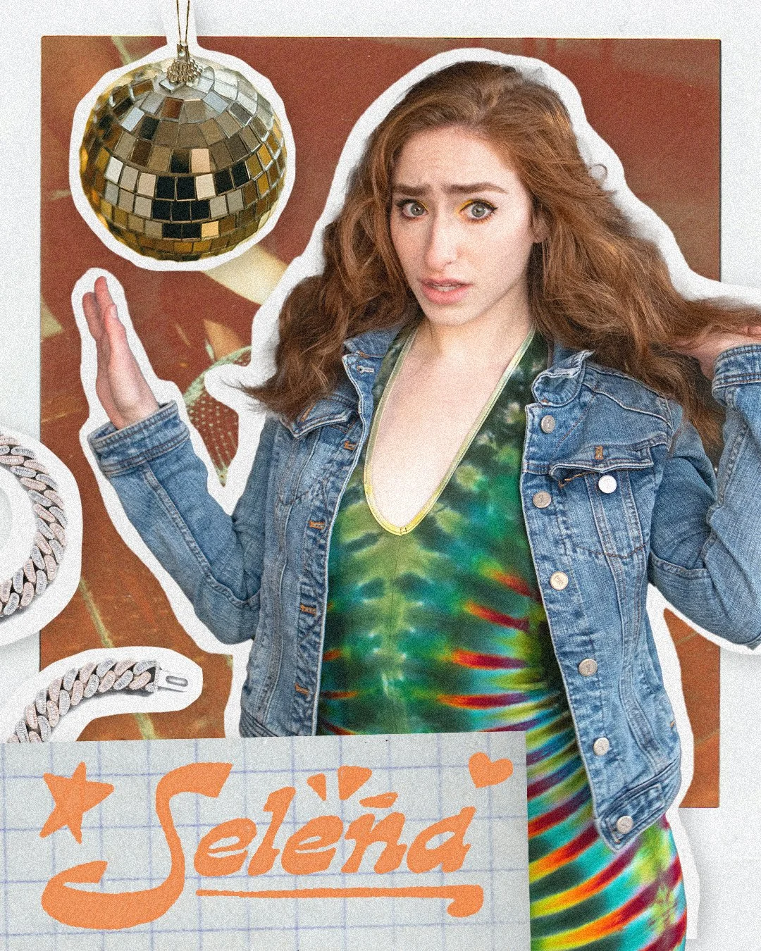
Selena is the classic entitled mean girl character. She has a tense conflict with Mindy early in the story, rushing to be the first to find a prized necklace, all the while belittling Mindy and demanding constant attention. Selena is Stacey’s lover, and the two are completely inseparable.
Selena and Stacey’s character designs are a clear homage to 70s disco, and I complemented their style with imagery of the era. I outlined their names in wavy retro fonts and included polaroids of disco parties behind them.
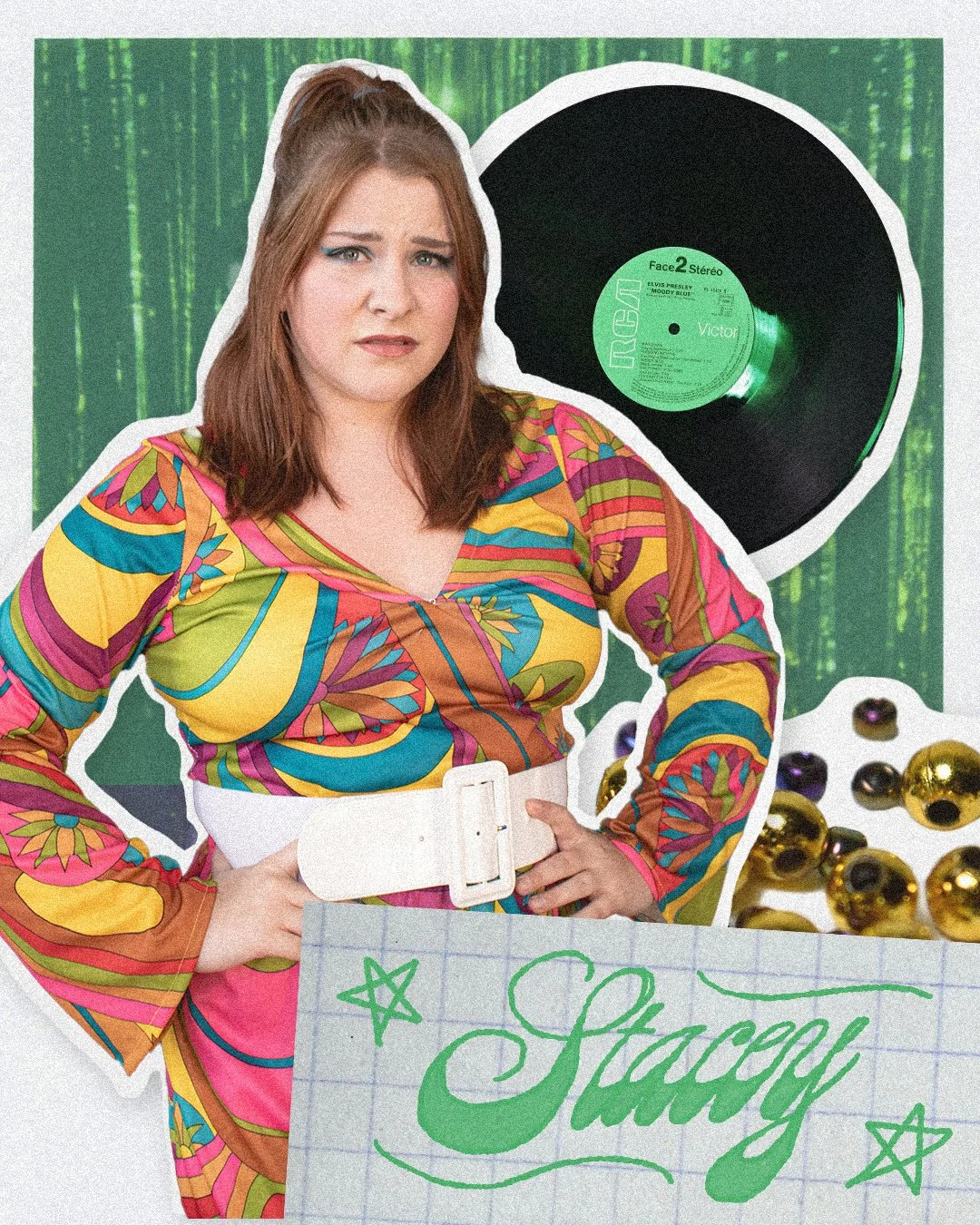
Stacey is Selena’s partner and closest supporter. The two form a perfect duo, never to be seen more than a few feet away from each other. Stacey has no sentimental object at stake, but she will do absolutely anything to make certain that Selena gets what she wants.
Just like her character design, Stacey’s poster is the counterpart to Selena’s. The two layouts are inverted, as if standing back-to-back, and the two color palettes are designed to complement each other within the 70s disco theme.
My posters served as a phenomenal microcosm of these beautifully designed and portrayed characters. I received resounding praise from my client and my faculty advisors, and the designs were quite a success on social media too. Shortly after the Otto’s Exhilarating Adventure project wrapped up, I submitted these graphics for consideration in the 2025 American Advertising Federation Awards, where I won a gold ADDY for online advertising and promotion in the Southern Illinois chapter competition. This project was a remarkable high point in my early career as a commercial artist.
