
Otto’s Exhilarating Adventure: Event Poster
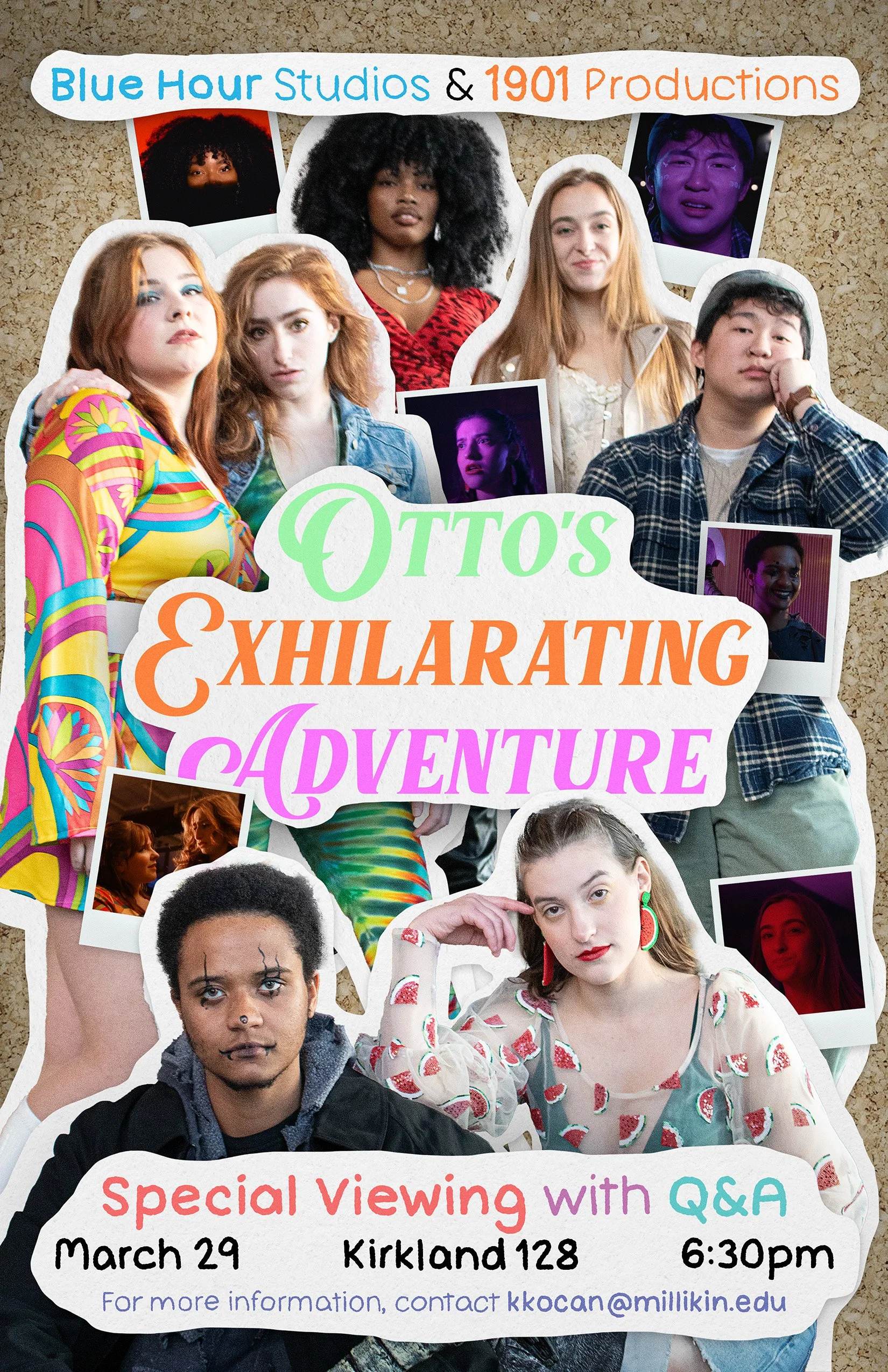
Official poster for the Otto’s Exhilarating Adventure promotional film screening, graphic design
This poster was a part of my comprehensive promotional campaign for the exclusive Millikin University screening of Otto’s Exhilarating Adventure—a film produced on Millikin’s campus by university alumni. My design needed to capture the film’s bubbly, lighthearted energy, provide key event information, and meet all university criteria for on-campus flyer distribution. The team at Blue Hour Studios provided me with raw images from a promotional photoshoot and various brand assets they wished to have included in the poster. Following a briefing with Kev Dionysus, my contact at Blue Hour Studios, I had a plan in mind and got to work.
I continued the design motifs of the character posters I created in the weeks prior, giving the composition a fun, handmade scrapbook feel. I wanted this poster to feel youthful and chaotic without becoming illegible—a perfect analog for the absurd but heartfelt narrative arc of the film. Using the photos provided to me, I cut the actors out of their backgrounds and created a layered paper effect by shaping rough, textured outlines behind them. I then filled pockets of empty space with Polaroid frames containing screenshots from the film. I chose shots that focused on characters while highlighting the film’s fantastic lighting and art direction. Subtle drop shadows were added to each layer to enhance the depth and visual clarity of this dense collage.
More important than any visual, however, was the proper information for the upcoming event. At a glance, passers-by needed to know what the event was and exactly when and where it would be hosted. I also included the names of the two Millikin-founded film studios producing the event for name recognition, along with a Millikin contact email to comply with the university’s standards for approved student flyers. The central title text was provided to me in the brand asset library, and all other supporting text was hand-lettered to continue conveying the fun and loose energy of the film. I chose bright colors that matched the rest of the composition, making sure that crucial information was bold and perfectly legible.
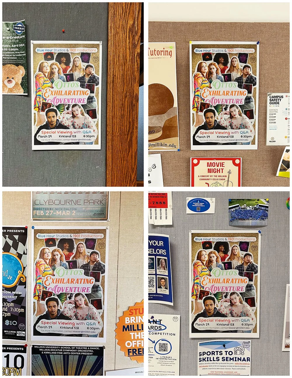
Event flyers posted across Millikin University’s campus
After multiple days of thoughtful, detail-oriented design, my poster was completed and sent to my client, who was delighted with my work. After a few small tweaks, I sent the final version to Millikin University’s Office of Student Affairs for approval and printing. Later that day, I pinned these promotional posters in high-traffic areas throughout every major building on campus. I also created a slimmed-down digital version of the design to be shared on Blue Hour’s social media and the School of Art and Creative Media’s student email feed.
I’m incredibly proud of my work on this design. It’s not a style that I typically work in, but it’s exactly what the project needed. I feel it strikes the perfect balance of chaos and readability, with an eye-catching visual identity that can draw attention from across a hallway or in the midst of an oversaturated social media landscape. The film screening went on to be a fantastic success, with a large volume of students and faculty attending and having an excellent time.
